
Art Lab · Illustration mentorship case study
Anastasia Mordasheva.
From portfolio strategy
to a paid commission.
A distinctive style, a clearer commercial direction and portfolio briefs chosen with future commissions in mind. How we developed Anastasia’s work for editorial and publishing opportunities, followed by a paid commission for elDiario.es as part of its collaboration with The Guardian.
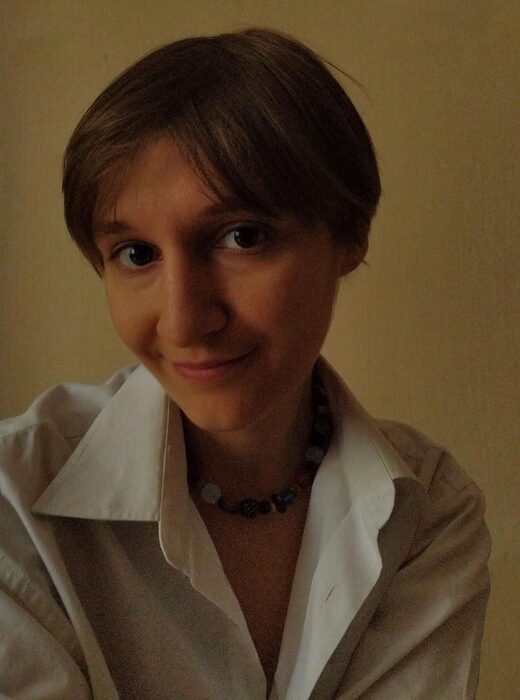
Anastasia MordashevaIllustrator · Portfolio development & agency promotion with Art Lab
- The direction
- Editorial illustration & publishing
- The strategy
- A portfolio shaped through tailored briefs
- Cases
- elDiario.es / The Guardian collaboration
01 / Choosing the direction
Where could her work
find its next commission?
The commercial goal was to help Anastasia move towards paid illustration commissions. She came to Art Lab with textured printmaking, stylised figures and a strong sense of atmosphere. Our starting point was to identify where those existing strengths could be useful to a commissioning client.
In her first portfolio review with Anya Kuvarzina, we identified a direction towards editorial illustration and publishing, including work for adult readers. Art Lab suggested developing visual metaphor and a more conceptual approach to help her use that distinctive style to communicate ideas. This became part of the strategy for positioning her work for UK and US clients.
The challenge was to make that potential visible across a body of work. A client looking through the portfolio needed examples that helped them imagine her approach in a publication. We wanted to build a stronger connection between her individual style and the kinds of projects she hoped to attract.
02 / Briefs with a purpose
Build the evidence
a future client could see.
We used tailored portfolio briefs to turn that direction into a plan. The briefs gave the new work a purpose, a reader and a context. Across the projects, the intention was to show how Anastasia’s visual language could communicate ideas, sustain a developed scene and work within the practical space of a publication.
We also identified gaps to address. Much of her existing work was black and white, so restrained colour palettes became one area to explore. Portfolio consistency was another: we wanted the work to feel connected while showing enough range to suggest different applications. These decisions shaped the briefs and the feedback around them.
The challenge: making each new piece contribute.
The early work moved through references, sketches and alternative treatments on a shared board. That let us review both the individual image and its role in the developing portfolio. Anastasia could test an approach, receive specific feedback and return with a more resolved version.
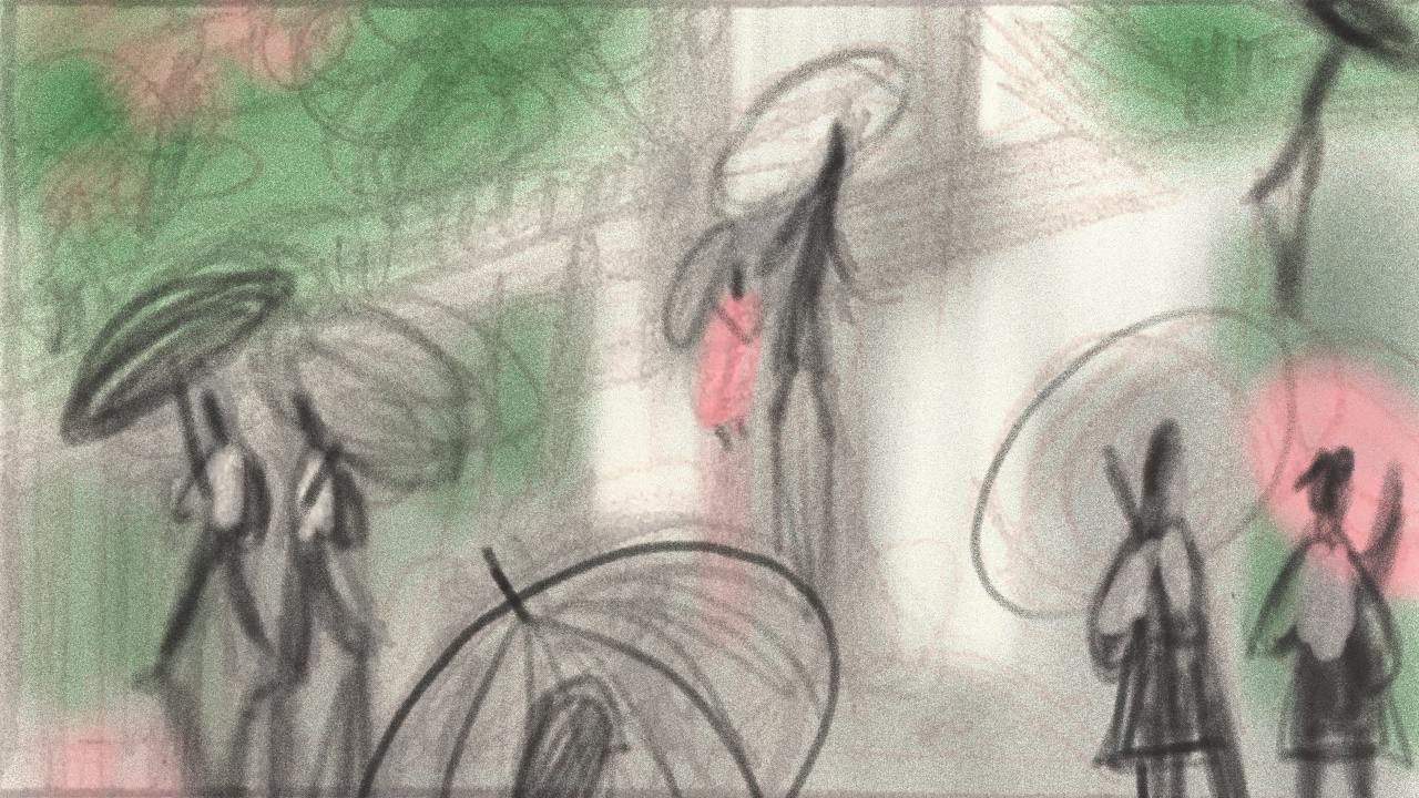
Finding the composition
A loose colour sketch brings figures, umbrellas and architecture together.
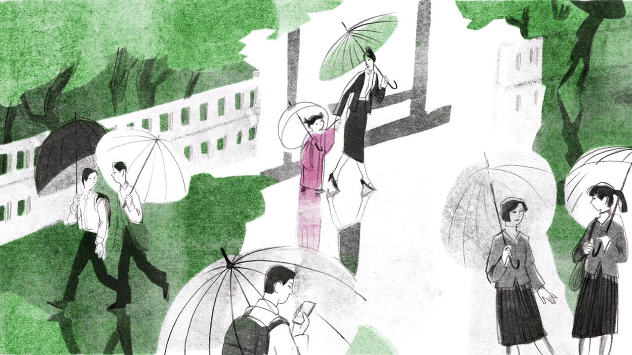
Developing the image
A later version has more defined figures, layered shapes and a restrained green-and-pink palette.
The development above shows an early step towards a fuller scene and a more deliberate use of colour. Alongside the artwork, we discussed different image formats and how an illustration could sit with typography. The purpose was to help her present work in a context a potential client could recognise.
03 / Showing editorial thinking
Make the portfolio
show how you think.
For the editorial direction, we wanted the portfolio to show Anastasia interpreting ideas. We encouraged her to explore visual metaphor through the layered imagery of her printmaking. The work needed to give an art director a sense of the thinking she could bring to an article, as well as the appearance of the finished illustration.
The challenge: developing a concept with her own visual language.
Around a year after the first review, during the later agency-development stage, Anastasia began this sequence with four possible approaches. The feedback encouraged her to make more of the depth and layering already present in her printmaking. This moved the discussion towards how the technique could help express the idea.
She explored overlapping figures, developed the selected composition and tested it in print. Each review asked whether the image was communicating clearly. The final revision in this sequence reworked the foreground and the balance of the image following that feedback.
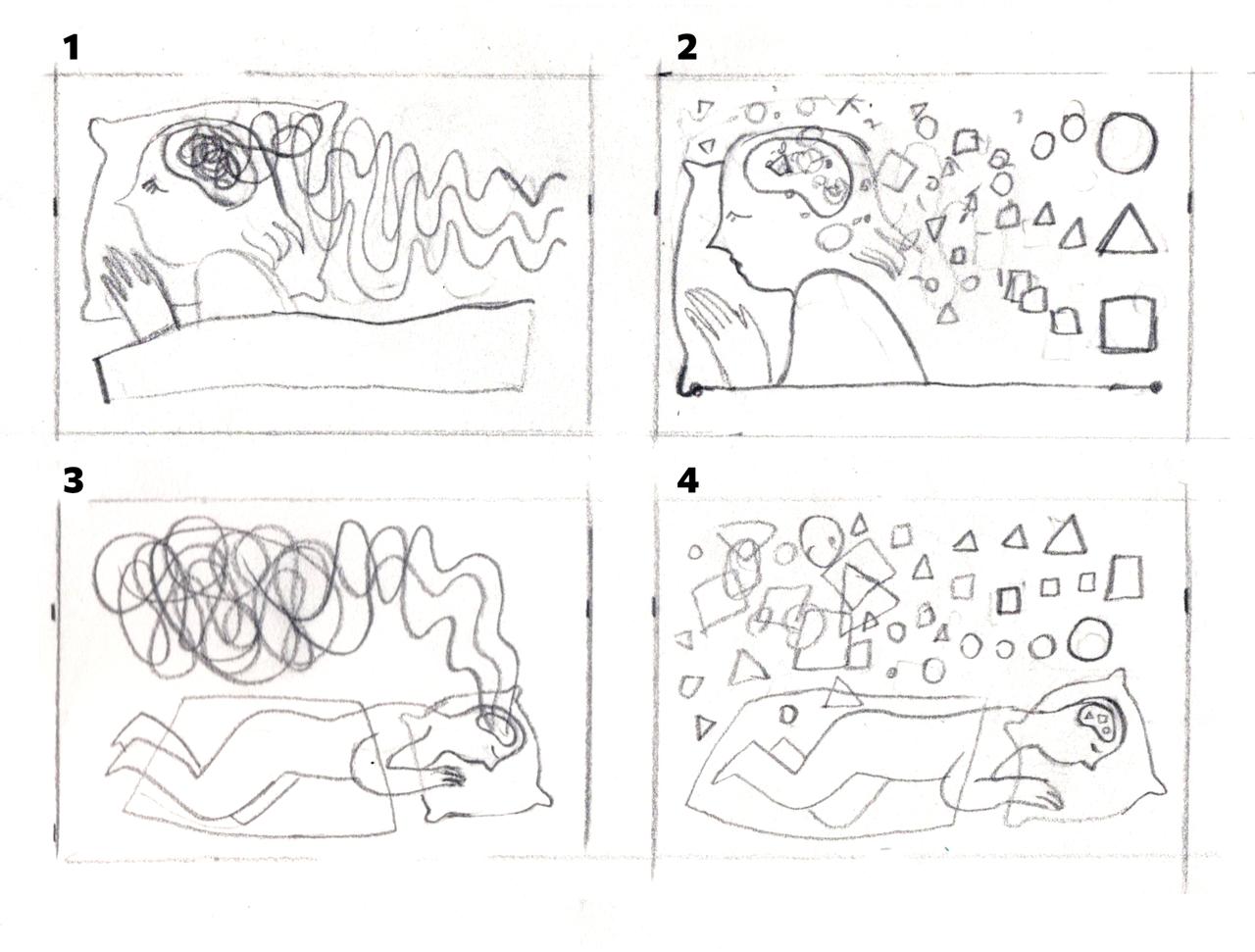
Explore several ideas
Four early options test the scale of the figure, the surrounding space and different arrangements of smaller elements.
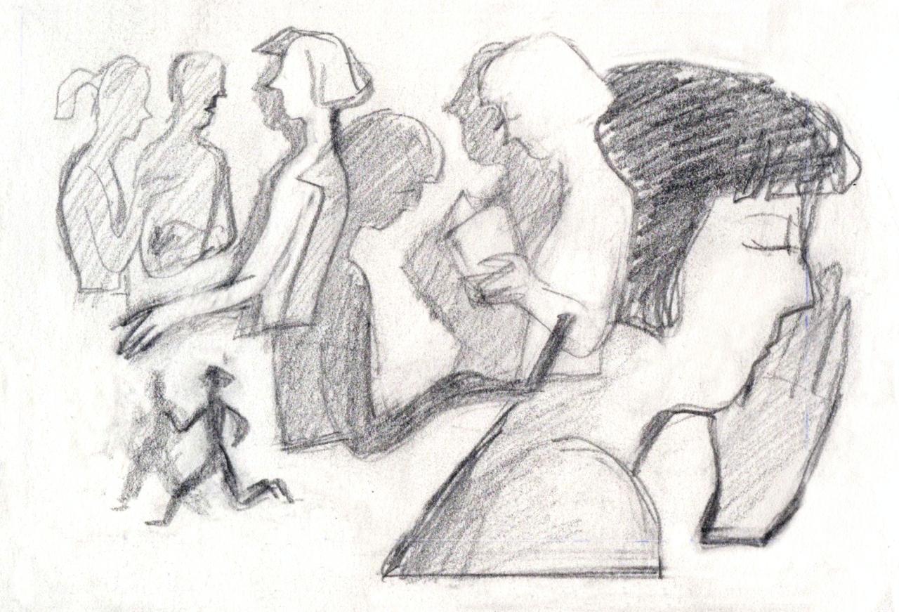
Build depth through layering
The next sketch uses overlapping figures. The feedback encouraged more breathing room between the dense and open areas.
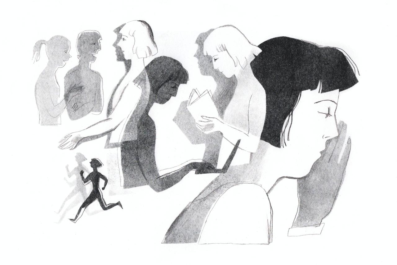
Test the idea in print
The first print gives the concept a physical form. The review asks how clearly the composition directs the viewer through the image.
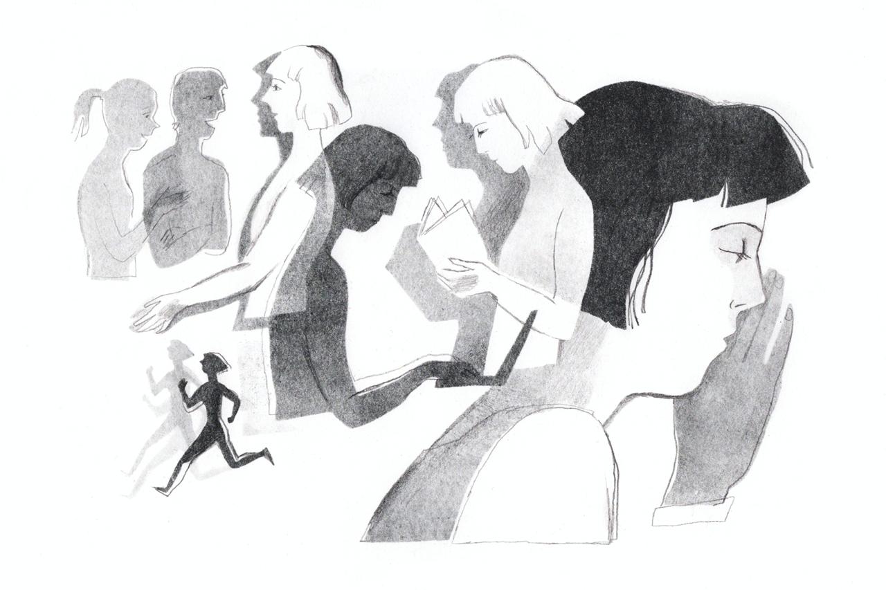
Refine the foreground
Anastasia returned with a reworked foreground figure and adjusted tonal balance, noting that she had developed the image following the feedback.
These stages show the connection between the portfolio strategy and the work itself. We were developing an example of how she could take an idea through several possibilities into a resolved image, using qualities that were particular to her practice.
“I’ll think about how to add depth and use layering. I think that really is more interesting — thank you.”
Selected excerpt from a feedback discussion, translated from Russian.
04 / Developing the idea
Carry a promising concept
through to finished work.
The next part of the strategy was to develop the work far enough to make its potential clear. A sketch can suggest a compelling image; the portfolio also needs to show how that promise carries through into a finished piece.
The challenge: keeping the story clear as the image develops.
In the sequence below, the original drawing had a strong sense of a figure turning back into the space. Some of that meaning became less apparent in the first print. The review returned to the sketch and used drawn feedback to identify what had changed.
Anastasia revised the illustration, and the following feedback noted that the movement had returned. The important step was recognising when a finished treatment had weakened the original idea, then making a focused change to recover it.
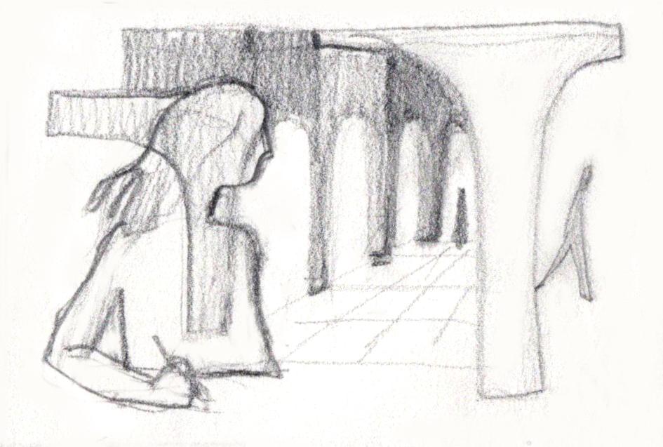
The initial sketch
A turning figure and a sequence of arches draw the eye backwards through the composition.
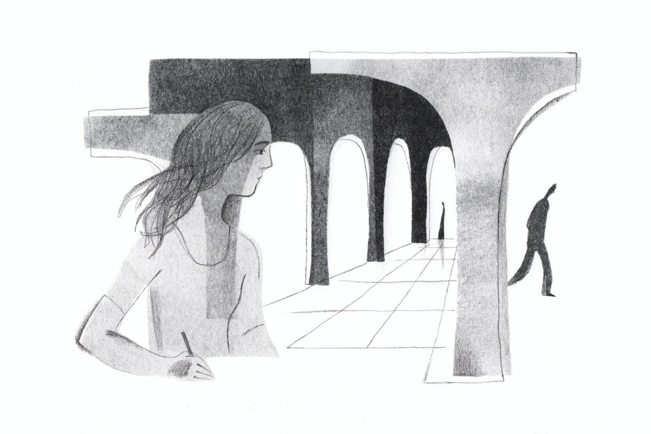
The first printed version
The review identified a change in how the figure’s movement read compared with the original sketch.
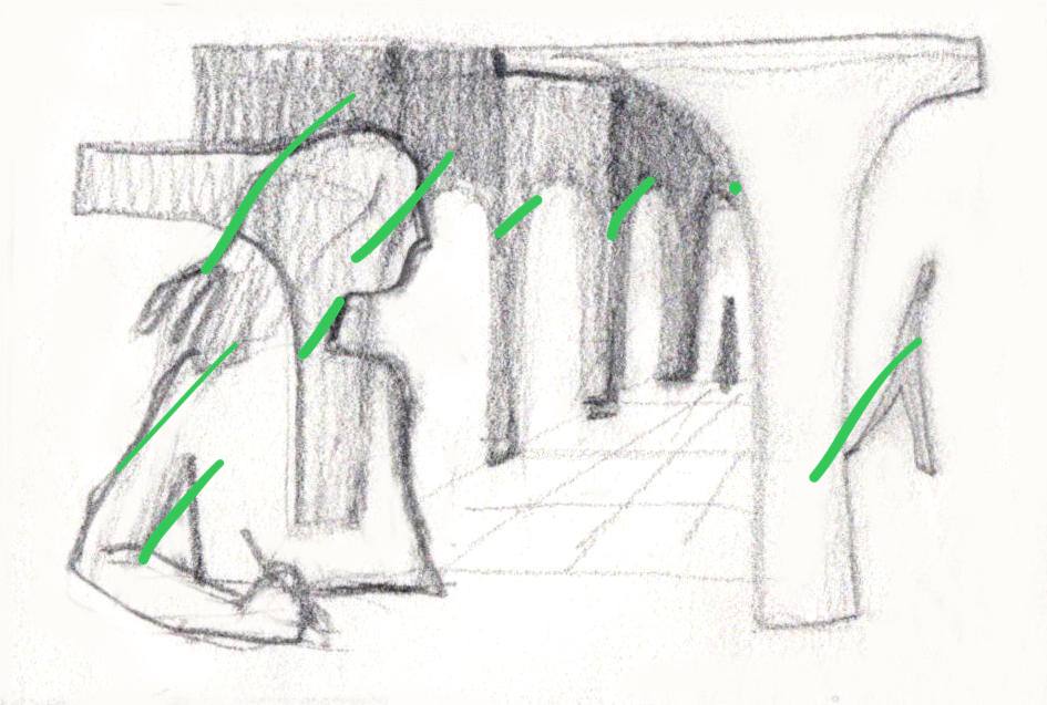
Feedback drawn on the sketch
The original green marks show the feedback drawn on the sketch during the review.
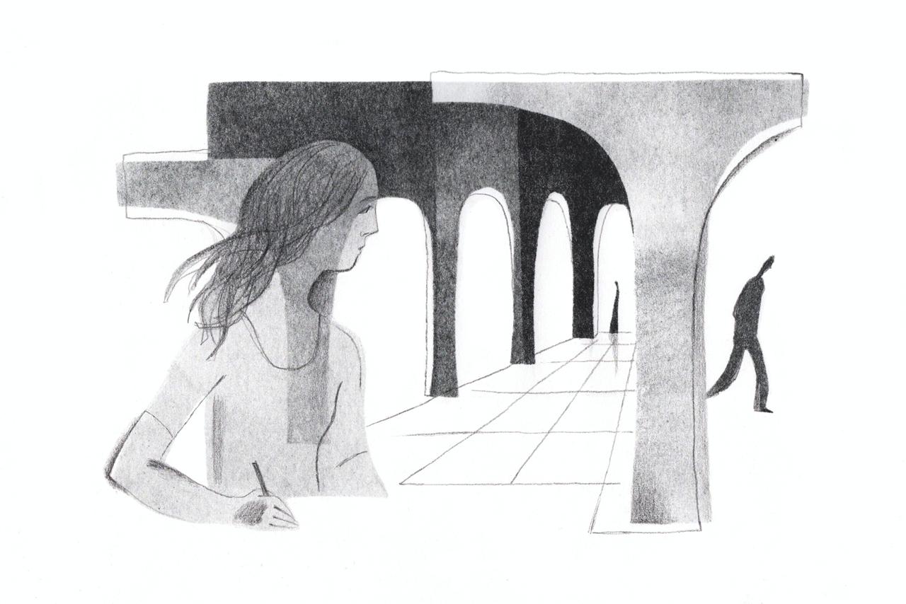
The revised illustration
Anastasia adjusted the face and eye detail. The following feedback noted that the sense of movement had returned.
This is where the work-in-progress images add something the final portfolio cannot show on its own. They record how she considered feedback and developed the chosen approach. In the mentorship, that process helped us judge when a piece was doing the job we wanted it to do.
05 / Expanding the visual language
Make the space
part of the idea.
We wanted Anastasia to develop more ways of expressing a concept within her printmaking style. The negative-space experiment introduced a specific possibility: use the areas left light to form an essential part of the image.
The challenge: make the technique contribute to the meaning.
Art Lab suggested reversing the relationship between light and dark, keeping the pillow and bedding pale while making the surrounding area dark. In the completed piece, those pale shapes form the subject and the dark field gives them emphasis. The space itself becomes an active part of the composition.
Anastasia initially questioned how the dark border would sit alongside work with white edges. We encouraged her to explore the idea as a standalone piece. This gave her room to test what the treatment could express before deciding how to group it within the portfolio.
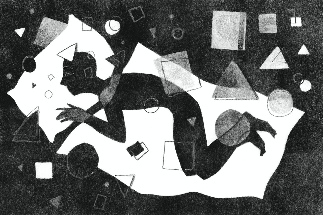
Three days later, she shared the finished work and felt the experiment had succeeded, while recognising its difference from the other pieces. The portfolio gained another way of constructing an image within her existing visual language.
“Thank you so much for your help and valuable advice!”
Selected excerpt translated from Russian.
06 / Art Lab’s pitching & promotion
Putting the portfolio
in front of clients.
During the later agency stage, Art Lab selected and pitched Anastasia’s work to publications and creative agencies. We looked at the illustration they were already commissioning and chose pieces whose tactile quality and atmosphere could fit that context. The pitching was tailored to the recipient, with follow-ups to keep the conversation moving.
Early editorial interest helped inform the next stage of development. We discussed how new work could build on the qualities that had caught an art director’s attention, then sent the developed pieces back for consideration and introduced them to other relevant publications. At this point, the response was interest; a paid project had yet to be agreed.
Alongside that pitching, Art Lab secured Anastasia’s illustrated interview with Artwort through our collaboration with the publication. The feature appeared around a year after her first portfolio review and gave her work a public presentation through her own illustrated answers.
Around three months after the Artwort feature, Art Lab secured a paid illustration commission for Anastasia with elDiario.es, as part of the publication’s collaboration with The Guardian. Anastasia created the commissioned artwork, bringing the story from portfolio development and targeted pitching to a published commercial project.
07 / Cases
Published work.
elDiario.es / The Guardian collaboration
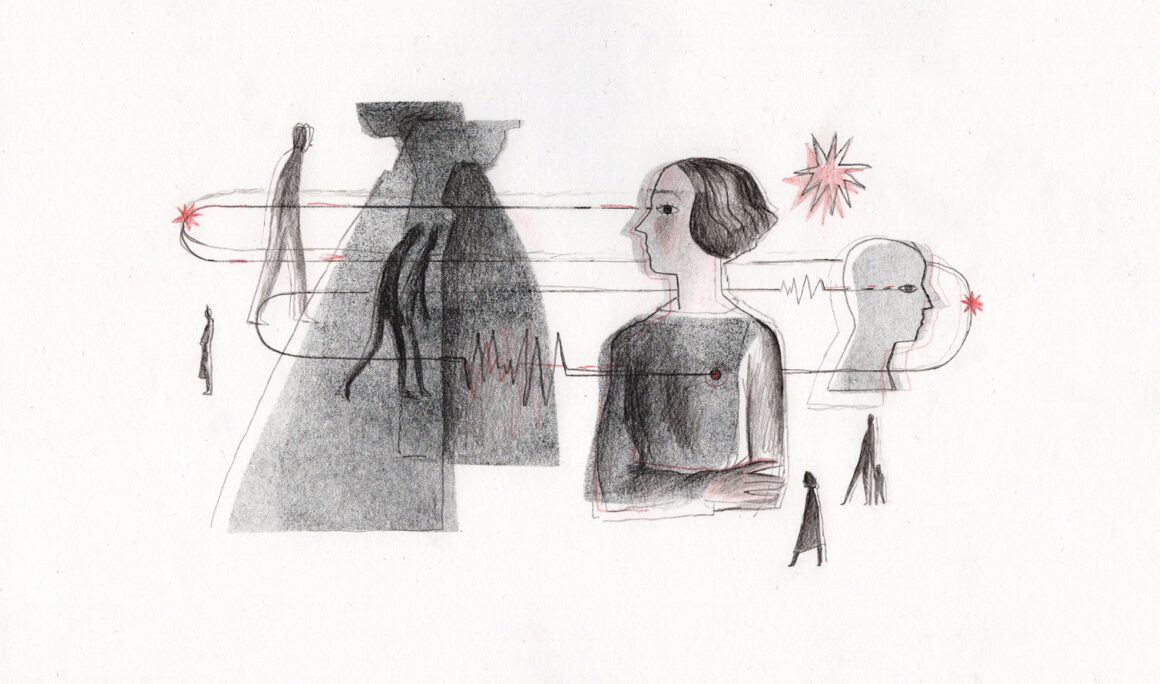
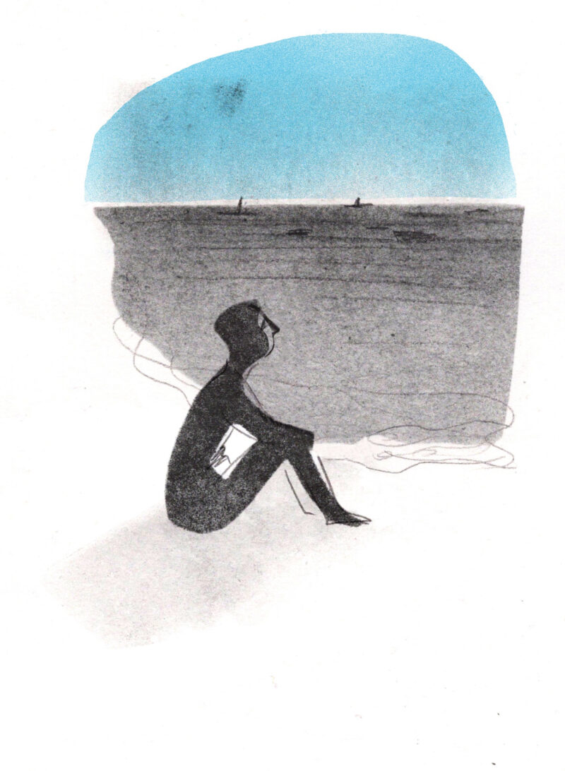
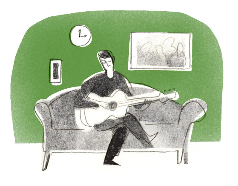
Anastasia’s commissioned illustration accompanied Katherine Rowland’s article about the commercialisation of emotional pain, published by elDiario.es.

The work was also included in elDiario.es’s annual selection of its best illustrations.
An illustrated interview with Artwort
The feature Art Lab arranged appeared in Artwort’s Disegnini series. Anastasia answered the interview questions through illustrations, introducing readers to her work and personality as part of the Art Lab × Artwort collaboration.
Follow the artist
See more of
Anastasia’s work.